
The coat you bought two years ago still fits perfectly. The cut is right, the fabric held up through two full seasons of heavy use. But something about the color — that particular warm golden camel — makes it feel like it belongs to a different moment. You can’t pin down exactly why. That feeling is what seasonal color trends actually do: they shift the context around the clothes you already own, making certain hues suddenly feel correct and others suddenly feel finished.
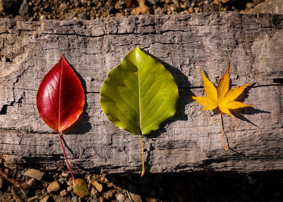
FW2026’s palette is not a dramatic break from what came before. It’s a deepening. The earthy, warm tones that dominated FW2026 are still present — but they’ve moved darker and in some cases cooler. Lighter camel gives way to deep cognac. Rust orange makes room for true oxblood. Bright kelly green descends into muted forest. Electric cobalt retreats into steel and slate. The overall direction is richer, more saturated, and noticeably quieter.
The FW2026 Color Palette Mapped Out
Six colors define this season. Not twelve, not twenty — six. Color forecasting organizations like WGSN and the Color Association of the United States have been consistent in their FW2026 direction, and runway collections confirm it: this is a focused palette rather than a scatter of competing trend colors.
| Color | Direction | Skin Tone Sweet Spot | Best Pairings | Buy Priority |
|---|---|---|---|---|
| Oxblood | Deep red with brown undertone — darker than burgundy, warmer than wine | All skin tones | Camel, ivory, charcoal | High — start with foundational pieces |
| Cognac | Warm amber-brown — lighter than chocolate, richer than camel | Warm undertones | Black, forest green, cream | Medium — replace existing rust pieces |
| Juniper Green | Deep forest, slightly muted — not bright, not yellow-toned | Cool and neutral undertones | Grey, slate blue, ivory | High — versatile across categories |
| Slate Blue | Cool steel, low saturation — reads as a cool neutral at distance | Cool undertones | Charcoal, white, plum | Medium — strongest in outerwear |
| Rich Plum | Blue-violet, deep — leaning cool rather than red-toned | Medium to deep skin tones | Black, grey, cognac | Low — test with accessories before clothing |
| Dark Chocolate | Warm brown, near-black — replaces golden camel as the season’s warm neutral | Warm and neutral undertones | Cognac, cream, oxblood | High — acts as neutral anchor |
Two absences are worth noting: rust orange and bright cobalt are not on this list. Both were central to FW2026. Both are fading. More on that later — but the short version is this: if you are planning to spend on a new seasonal color, those two should not be it.
Dark chocolate and juniper green are the palette’s stealth workhorses. They function as true neutrals within the FW2026 color story — able to anchor a monochrome outfit or pair cleanly with everything else on the list. If budget is the constraint, these two colors return more outfit value per piece than oxblood or plum, both of which require more deliberate styling across multiple combinations. One practical note: the buy priority column in the table above assumes a wardrobe that already has solid black, grey, ivory, and white pieces. Trend colors do not cover for a weak neutral foundation.
Oxblood Is the Season’s Dominant Color
Oxblood is the single most important FW2026 color. It appeared in knitwear, outerwear, leather goods, and accessories across Bottega Veneta, Toteme, and Loewe’s autumn collections — three designers who rarely land on the same color by coincidence. It works because it reads as a near-neutral at a distance (dark, muted, serious) while registering as fully intentional up close. Buy one foundational piece in oxblood — a sweater, a long coat, or a structured leather bag — before adding anything else from this season’s palette.
How Undertones Decide Whether a Trend Color Works on You
Buying a color because it is trending and then never wearing it is one of the most consistent wardrobe mistakes. The piece fits. The quality is good. But something about it near your face looks off — slightly grey, slightly yellow, slightly drained. Usually the problem is not the color itself. It is the undertone of that specific version of the color.
Undertone theory in clothing works the same way as it does in makeup. Your skin has a warm base (yellow, golden, peachy), a cool base (pink, red, blue), or a neutral base (a mix of both). Colors with matching undertones sit harmoniously near your face. Colors that clash add an unwanted cast to your complexion — and no amount of styling fixes that at the root.
Warm Undertones: Your FW2026 Priority List
If your skin has warm undertones — gold jewelry tends to look better than silver, and the veins on the inside of your wrist appear green — the FW2026 colors that work hardest for you are cognac, dark chocolate, and oxblood. All three carry a brown or red-brown base that complements golden, peachy, or olive skin. They deepen the complexion rather than drain it.
Juniper green can work here too, but the specific version matters. A juniper with an olive or khaki edge (yellow-biased green) will complement warm undertones. A juniper that leans purely blue-forest will not. Hold the actual garment near your face in natural daylight before committing. Slate blue and rich plum carry real risk for warm-toned skin — both have significant cool and blue bases that can read ashy against golden complexions. If you want something in the purple family, look for a burgundy-plum (more red-biased, less violet) rather than the true blue-plum direction.
Cool Undertones: Strong Options This Season
Cool-toned skin — silver jewelry suits you better, wrist veins look distinctly blue or purple — has the most options in the FW2026 palette. Juniper green in its true forest form works well. Slate blue is an obvious fit. Rich plum in its deepest blue-violet form can look striking against cool or fair skin with pink undertones.
The colors to approach carefully: cognac and the warmest versions of dark chocolate. Both skew warm-yellow and can make cool undertones appear sallow or muddy. If you want to incorporate brown tones, look for versions closer to espresso than amber — darker and less warm-saturated.
Neutral Undertones: Widest Access This Season
Neutral undertones — both gold and silver work, your wrist veins read blue-green rather than distinctly one direction — have access to the full FW2026 palette without major risk. The only calibration needed is saturation. A very deep, highly saturated plum can overpower lighter complexions even with neutral undertones. Choosing a slightly dusty or muted version of the same hue solves this without abandoning the color direction.
The fastest practical test: hold any piece directly under your chin in natural daylight. Skin looks brighter, clearer, and more even — the color works. Skin looks greyer or more yellow — try a different shade within the same family. Thirty seconds. No fitting room required, and it prevents the kind of expensive mistake that ends with a perfectly good sweater living permanently at the back of the wardrobe.
Five FW2026 Colors That Have Already Peaked
These five colors have not vanished — you will still see them on the high street through the seasonal transition — but buying heavily into any of them now means wearing an outdated palette by mid-season.
- Rust Orange. The breakout color of FW2026. It still works in small doses, particularly in accessories, but as a main clothing color it has hit saturation point. Zara and H&M both started phasing rust from core seasonal ranges in early 2026, which is typically the clearest signal that a trend color has crested. The replacement is cognac: same warm-amber family, darker, and with enough brown base to feel current rather than last-season. If you own rust pieces already, keep them. Just do not buy more.
- Bright Cobalt Blue. Electric cobalt was everywhere in FW2026 knitwear and bags. The FW2026 replacement is slate blue — quieter, cooler in tone, and more wearable across a wider range of contexts. The practical difference: cobalt demands to be the focal point of any outfit; slate blue layers and mixes without that pressure. Mango’s seasonal outerwear lineup for FW2026 already shows this shift clearly — the cobalt option from last season is simply gone.
- Kelly Green. The vivid, high-saturation green that ran through 2026 and into FW2026 has moved into its quieter successor: juniper and deep forest green. The new versions sit better in heavier fabrics and outerwear proportions. Existing kelly green pieces are still wearable — pairing them with dark chocolate rather than black updates the combination without requiring anything new.
- Lavender. Soft lavender had a longer run than most color trends manage, carrying from SS2026 through FW2026. The direction for FW2026 is unambiguously deeper — rich plum rather than muted lilac. Lavender in accessories remains entirely wearable. As a main clothing color, it reads one season behind. If you have lavender knitwear, layer it under dark outerwear where it reads as an accent rather than the primary color statement.
- Warm Golden Camel. This is the most nuanced transition on the list. Camel as a category is not going anywhere — it is a perennial neutral. But the specific warm, bright-gold version that defined FW2026 outerwear is being replaced by darker, less golden alternatives: chocolate brown and slate. If your wardrobe is heavily weighted toward golden camel, the FW2026 palette will pair awkwardly against it. One dark anchor piece — a chocolate trouser or a slate knit — can rebalance the whole wardrobe without a full replacement.
A principle worth applying before buying any replacement color: check what you already own first. The FW2026 palette pairs cleanly with black, ivory, mid-grey, and navy — basics most people already have in quantity. The gap between your current wardrobe and a seasonally relevant one is almost certainly smaller than it looks from the outside.
Also resist the impulse to buy every new color at once. Five trend colors in a single season creates a wardrobe problem — pieces that only work within that trend palette and cannot combine with anything outside it. Two or three well-chosen colors, introduced deliberately, give more outfit combinations than six trend colors that do not connect with each other or with what you already own.
The Right Order to Build Into the FW2026 Palette
Buy dark chocolate or juniper green first — not oxblood, not plum. This is the counterintuitive recommendation, and it is the right one.
Oxblood and plum generate the most editorial coverage this season. They feel the most trend-forward and photograph best. That is also exactly why they should come second, not first. If you buy oxblood before confirming it integrates with your existing wardrobe, you risk adding a piece that creates new outfit problems rather than completing existing ones. More shopping, not less.
Dark chocolate, by contrast, works as a direct replacement neutral. A chocolate wool coat from Arket or & Other Stories slots into almost any existing wardrobe — it pairs with black, grey, ivory, and denim in the same way a navy coat does. A juniper green sweater from Acne Studios or Mango’s merino range works cleanly with black trousers, charcoal knitwear, and ivory shirts — things most people already own in significant quantity.
Step 1: Replace a Worn Basic in a Trend Neutral
Identify one basic piece you need to replace anyway — a sweater that has worn through, a coat that is past its prime. Replace it in dark chocolate or juniper green rather than your usual black or grey. You lose nothing in wearability; you gain a color that is actively current. This is the lowest-risk entry point into the FW2026 palette, and it costs exactly what you would have spent on the replacement anyway.
Step 2: Add Oxblood in One Statement Function
Once your neutral trend color is confirmed working with your wardrobe, add oxblood — but deliberately. A bag, a scarf, or leather gloves in oxblood introduces the season’s dominant color without requiring any outfit rethinking. Leather goods in this colorway have been particularly strong from Polène and Strathberry, both of which hit an accessible price point relative to full luxury alternatives. If going for clothing, a sweater is lower commitment than a coat.
Step 3: Test Plum or Slate with the Cheapest Entry First
Rich plum and slate blue are the two FW2026 colors most dependent on your undertone and contrast level. A wool scarf, a cashmere hat, or a pair of tights in either color costs a fraction of a clothing piece and tells you immediately whether the hue actually works near your face. If it does, scale up with confidence. If it does not, you have learned that for £20 rather than £150 or more.
Two or three well-chosen pieces in the right FW2026 hues will outlast a wardrobe full of trend purchases that never quite connect with each other.


